
Field editor
The field editor allows users to define fields for objects managed by Xperience (content types, system classes, object types). Each field matches a column in the database table belonging to the corresponding object.
A field’s main attributes are its:
- name – a unique identifier.
- data type – the type of data stored by the field in the underlying database column (string, integer, binary, etc.).
- assigned value editor – the input interface used to edit the field. Dictated by the UI form component selected to manage the field (a drop-down list, check box, etc.).
Together, fields defined for an object comprise a form used to edit the corresponding field values. Forms created in this fashion appear in various places throughout the administration interface, depending on the object (e.g., in the Content of pages in a website channel application when creating new pages based on content types).
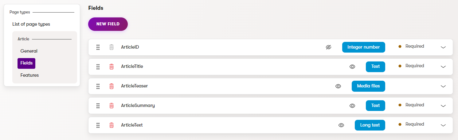
You can use the field editor to:
Create new fields
Select New field to add new fields.
General | |
Field name | Sets the name used for the database column (or XML field) that stores the values of the field. Also serves as the field’s unique identifier. |
Data type | Sets the data type of the field’s value (also determines the data type used by the field’s representation in the database). Note: You may encounter an error when attempting to change the data type for fields that already store values of the original type. Most types of values cannot automatically be converted to a different data type (for example text values to date and time). In these cases, you either need to write and run custom code that changes the field type and correctly converts all values, or delete the existing field (and discard all current values) and then create a new field of the required type. |
Size | Sets the maximum amount of characters that can be entered into the field. Only available if the Data type is set to Text or Long text. |
Required | If checked, the form can only be saved if this field has a value specified. Disable to make the field optional. |
Default value | Default value of the field pre-filled when the form is loaded. |
Display field in the editing form | Indicates if the given field should be shown in the form to users. This can be disabled for fields that store internal or system values. |
Field appearance | |
Field caption | Sets the text displayed next to the field in the form. |
Tooltip text | Tooltip which is displayed if a user hovers over the field. |
Text below the input | Text displayed directly below the field in the form. |
Form component | Selects the form control through which users interact with the field in the editing form. |
Form component configuration | |
The settings in this section provide a way to configure the parameters defined for the selected UI form component. The available options depend on the parameters defined for the given form component. See the tooltips of individual parameters for more information. | |
Validation | |
Validation rules | Specifies the input which the user is allowed to submit in the field. To add a validation rule, click Add rule. You can add multiple validation rules for one field, but be careful not to create contradictory rules. See UI form component validation rules for more information about field validation rules. |
Field operations
Move fields
You can change the position of a field using the drag handle ().
Moving fields also changes their positions in the resulting form.
Delete fields
You can delete existing fields by selecting the Delete () icon. This operation is irreversible and you will lose all data stored under the field.
UI form components
Form components define the editing interface for fields that comprise editing forms in the Xperience administration interface. Each field is assigned a single form component that serves as its editing interface, such as a text box for user input, a group of radio buttons, or a drop-down selector.
All editing forms in the Xperience administration are based on UI form components:
- Content type editing forms (Content view mode)
- Configuration dialogs of admin UI editing forms (Page Builder components, Form Builder components, other editing dialogs). See Editing components.
- Editing forms of object types (UI forms)
Form components are implemented as conventional C# objects with their interface provided by a React component. See UI form components for more information.