
Reference - React input components
This page provides an overview of input components from the @kentico/xperience-admin-components package that can be used to define editing interfaces for admin UI form components.
Checkbox
onChange event Type: React.ChangeEventHandler<HTMLInputElement>
A binary state input.
The checkbox component has the following configurable properties:
label
Type: label?: string
Sets the label for the checkbox.
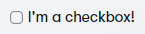
import { Checkbox } from "@kentico/xperience-admin-components";

<Checkbox label="I'm a checkbox!" />
size
Type: size?: CheckboxSize
Sets the size of the checkbox to one of three sizes defined by the CheckboxSize enum. Defaults to CheckboxSize.M if not set.
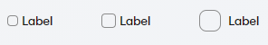
Value | Example |
CheckboxSize.S | |
CheckboxSize.M | |
CheckboxSize.L | |
checked
Type: checked?: boolean
Indicates a checked state. Defaults to false.

import { Checkbox } from "@kentico/xperience-admin-components";

<Checkbox label="Label" checked />
indetermined
Type: indetermined?: boolean
Indicates an indeterminate state. Defaults to false.

import { Checkbox } from "@kentico/xperience-admin-components";

<Checkbox label="Label" indetermined />
tooltipText
Type: tooltipText?: string
Sets the tooltip for the checkbox.
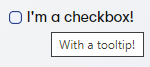
import { Checkbox } from "@kentico/xperience-admin-components";

<Checkbox label="I'm a checkbox!" tooltipText="With a tooltip!" />
onChange
Type: onChange?: (event: React.ChangeEvent<HTMLInputElement>, checked: boolean) => void;
Allows the consumer to bind an onChange event handler.
import { Checkbox } from "@kentico/xperience-admin-components";

<Checkbox label="Label" onChange={() => window.alert("Clicked!")} />
Inherited properties
The component also inherits the following properties from [HTMLInputElement](https://developer.mozilla.org/en-US/docs/Web/API/HTMLInputElement){target="_blank"}.
- name
- onClick
- required
- disabled
- tabIndex
Input
onChange event Type: React.ChangeEventHandler<HTMLInputElement>
Conventional text input element.
The input component has the following configurable properties:
- label
- invalid
- value
- type
- validationMessage
- actionElement
- explanationText
- labelDisabledTooltip
- labelIcon
- labelIconTooltip
- markAsRequired
- inputRef
- Inherited properties
label
Type: label?: string
Element label.
invalid
Type: invalid?: boolean
Displays the specified validation message and changes element style to indicate incorrect input.
value
Type: value?: string | number
Sets the value of the input.
type
Type: type?: ‘text’ | ‘password’ | ‘email’ | ‘number’
Sets the HTML5 input type.
validationMessage
Type: validationMessage?: string
Sets the validation message displayed when the component contains invalid input.
actionElement
Type: actionElement?: React.ReactNode
Specifies an element rendered inside the input.
actionElement={<Icon name={ open ? 'xp-chevron-up' : 'xp-chevron-down'} />}
explanationText
Type: explanationText?: string
Sets text displayed directly under the input. Used to clarify input requirements to users.
labelDisabledTooltip
Type: labelDisabledTooltip?: string
Sets label text used when the input is disabled.
labelIcon
Type: labelIcon?: IconName
Sets the icon rendered next to the label.
labelIconTooltip
Type: labelIconTooltip?: string
Sets the tooltip text of the icon rendered next to the label.
markAsRequired
Type: markAsRequired?: boolean
Indicates if the input is required. If true, renders a small red asterisk in front of the component label text.
inputRef
Type: inputRef?: RefObject<HTMLInputElement>
Text input ref.
Inherited properties
The component also inherits the following properties from [HTMLInputElement](https://developer.mozilla.org/en-US/docs/Web/API/HTMLInputElement){target="_blank"}.
- onChange
- disabled
- readOnly
- name
- onClick
- onKeyPress
- min
- max
- id
- placeholder
- tabIndex
- onBlur
Select
onChange event Type: string
Drop-down menu. The element defines its options by its children.
The selector component has the following properties:
- label
- invalid
- value
- maxContentHeight
- onChange
- validationMessage
- explanationText
- labelDisabledTooltip
- labelIcon
- labelIconTooltip
- markAsRequired
- inputRef
- Inherited properties
label
Type: label?: string
Element label.
invalid
Type: invalid?: boolean
Displays the specified validation message and changes element style to indicate incorrect input.
value
Type: value?: string | number
Sets the value of the input.
maxContentHeight
Type: maxContentHeight?: string
onChange
Type: (value?: string) => void
Allows the consumer to bind an onChange event handler.
validationMessage
Type: validationMessage?: string
Sets the validation message displayed when the component contains invalid input.
explanationText
Type: explanationText?: string
Sets text displayed directly under the input. Used to clarify input requirements to users.
labelDisabledTooltip
Type: labelDisabledTooltip?: string
Sets label text used when the input is disabled.
labelIcon
Type: labelIcon?: IconName
Sets the icon rendered next to the label.
labelIconTooltip
Type: labelIconTooltip?: string
Sets the tooltip text of the icon rendered next to the label.
markAsRequired
Type: markAsRequired?: boolean
Indicates if the input is required. If true, renders a small red asterisk in front of the component label text.
inputRef
Type: inputRef?: RefObject<HTMLInputElement>
Text input ref.
Inherited properties
The component also inherits the following properties from [HTMLInputElement](https://developer.mozilla.org/en-US/docs/Web/API/HTMLInputElement){target="_blank"}.
- disabled
- readOnly
- name
- onClick
- onKeyPress
- min
- max
- id
- placeholder
- tabIndex
- onBlur Use a custom property to send a collection of options from the back end to the client. For example:
using System.Linq;
using System.Threading.Tasks;

using CMS.Membership;

using Kentico.Xperience.Admin.Base.Forms;

public class DropDownOption
{
    public string Value { get; set; }
    public string Text { get; set; }
}

public class MyComponentClientProperties : FormComponentClientProperties<string>
{
    public IEnumerable<DropDownOption> Options { get; set; }
}

public class MyFormComponent : FormComponent<MyComponentClientProperties, string>
{
    protected override Task ConfigureClientProperties(MyComponentClientProperties clientProperties)
    {
        clientProperties.Options = UserInfo.Provider.Get()
                                .GetEnumerableTypedResult()
                                .Select(user => new DropDownOption()
        {
            Value = user.UserID.ToString(),
            Text = user.UserName
        });

        return base.ConfigureClientProperties(clientProperties);
    }
}
On the client, map the collection to MenuItem components passed as children to the selector. This ensures a consistent appearance.
import { MenuItem, Select } from '@kentico/xperience-admin-components';
import { FormComponentProps } from '@kentico/xperience-admin-base';

export interface DropDownOption{
    value: string;
    text: string;
}

export interface MyFormComponentProps extends FormComponentProps {
    options : DropDownOption[];
}

export const MyFormComponent = (props: MyFormComponentProps) => {

    return (
        <Select onChange={(val) => props.onChange?.(val)}>
            {props.options?.map((item, index) => {
                return <MenuItem
                    primaryLabel={item.text}
                    value={item.value}
                    key={index}
                />;
            })}
        </Select>
    );
}
RadioGroup
onChange event Type: string
Radio button group selector. Allows single selection. Uses RadioButton components for selectable options.
The component has the following properties:
- label
- invalid
- value
- size
- disabled
- children
- onChange
- validationMessage
- explanationText
- labelDisabledTooltip
- labelIcon
- labelIconTooltip
- markAsRequired
label
Type: label: string
Element label.
invalid
Type: invalid?: boolean
Displays the specified validation message and changes element style to indicate incorrect input.
value
Type: value?: string
Sets the value of the input.
size
Type: size?: RadioGroupSize
Sets the option size.
disabled
Type: disabled?: boolean
Indicates disabled status.
onChange
Type: onChange?: (value: string) => void
Occurrs when the component state changes. value contains RadioButton.value of the current selection.
children
Type: children: React.ReactNode
A collection of RadioButton components representing selectable options.
validationMessage
Type: validationMessage?: string
Sets the validation message displayed when the component contains invalid input.
explanationText
Type: explanationText?: string
Sets text displayed directly under the input. Used to clarify input requirements to users.
labelDisabledTooltip
Type: labelDisabledTooltip?: string
Sets label text used when the input is disabled.
labelIcon
Type: labelIcon?: IconName
Sets the icon rendered next to the label.
labelIconTooltip
Type: labelIconTooltip?: string
Sets the tooltip text of the icon rendered next to the label.
markAsRequired
Type: markAsRequired?: boolean
Indicates if the input is required. If true, renders a small red asterisk in front of the component label text.
Use a custom property to send a collection of options from the back end. See the select component for an example.
On the client, pass the collection of options as children using the RadioButton component.
import { RadioButton, RadioGroup } from '@kentico/xperience-admin-components';

export const MyFormComponent = (props: MyFormComponentProps) => {

    return (
        <RadioGroup label='Choose' onChange={(val) => props.onChange?.(val)}>
            <RadioButton value='Cat'> Cat </RadioButton>
            <RadioButton value='Dog'> Dog </RadioButton>
        </RadioGroup>
    );
}
RichTextEditor
onChange event Type: string
Rich text editor built using Froala WYSIWYG.
Textarea
onChange event Type: React.ChangeEventHandler<HTMLTextAreaElement>
A text area.
The selector component has the following properties:
- label
- value
- invalid
- validationMessage
- minRows
- maxRows
- explanationText
- labelDisabledTooltip
- labelIcon
- labelIconTooltip
- markAsRequired
- textAreaRef
label
Type: label?: string
Element label.
value
Type: value?: string
Sets the value of the input.
invalid
Type: invalid?: boolean
Displays the specified validation message and changes element style to indicate incorrect input.
validationMessage
Type: validationMessage?: string
Sets the validation message displayed when the component contains invalid input.
minRows
Type: minRows?: number
Specifies the visible height of a text area, in lines.
maxRows
Type: maxRows?: number
Specifies the visible height of a text area, in lines.
explanationText
Type: explanationText?: string
Sets text displayed directly under the input. Used to clarify input requirements to users.
labelDisabledTooltip
Type: labelDisabledTooltip?: string
Sets label text used when the input is disabled.
labelIcon
Type: labelIcon?: IconName
Sets the icon rendered next to the label.
labelIconTooltip
Type: labelIconTooltip?: string
Sets the tooltip text of the icon rendered next to the label.
markAsRequired
Type: markAsRequired?: boolean
Indicates if the input is required. If true, renders a small red asterisk in front of the component label text.
textAreaRef
Type: textAreaRef?: RefObject<HTMLTextAreaElement>
Text area input ref.
Inherited properties
The component also inherits the following properties from [HTMLTextAreaElement](https://developer.mozilla.org/en-US/docs/Web/API/HTMLTextAreaElement){target="_blank"}.
- onChange
- disabled
- readOnly
- name
- onClick
- onKeyPress
- id
- placeholder