
UI form components
Admin UI form components define the editing interface for fields that comprise forms used to edit objects and pages in the Xperience administration.
Each form field is assigned a single form component. The component then manages the field’s editing interface by providing, for example, a text box, a group of radio buttons, or a drop-down selector.
Form components are usable with all editing forms based on the Xperience form engine, including the following:
- Content type editing forms (Content view mode)
- Editing forms of system objects (classes)
- As editing components within configuration dialogs of Page Builder components, Form Builder components, and other admin UI components
Xperience provides a robust set of form components by default. See Reference - Admin UI form components. Additionally, the system allows you to create custom form components for your specific use cases.
Table of contents:
- Assign form components to fields
- Create custom form components
- Component commands
- Field data type management
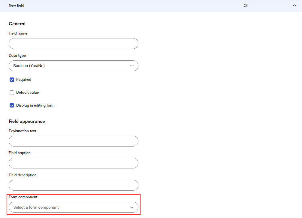
Assign form components to fields
Form components are assigned to individual fields when creating or editing Xperience objects via the field editor.
Editing components
In addition to the field editor, form components are also used programmatically to create editing dialogs for the properties of other objects within the admin UI. The documentation refers to such components as editing components.
Using form components in this fashion allows developers to build configuration interfaces for the properties of:
- components used by Page Builder (widgets, sections, templates, personalization conditions)
- components used by Form Builder (form components, sections, validation rules, visibility conditions)
- admin UI form components (other form components, validation rules, visibility conditions, UI pages with forms)
For more information, see Editing components.
Create custom form components
In addition to form components provided by the system, you can implement custom form components fulfilling your particular requirements.
A form component implementation consists of the following parts:
- Back-end definition – the form component base class and corresponding properties classes that store its configuration. Located in the ASP.NET Core project.
- Front-end React component – a React component that renders the editing interface for obtaining input from users. Located in the client JS module.
- Registration attribute – a C# assembly attribute that registers the component to the system and ties the back-end definition to the React component.
The following diagram provides an overview of form component architecture:
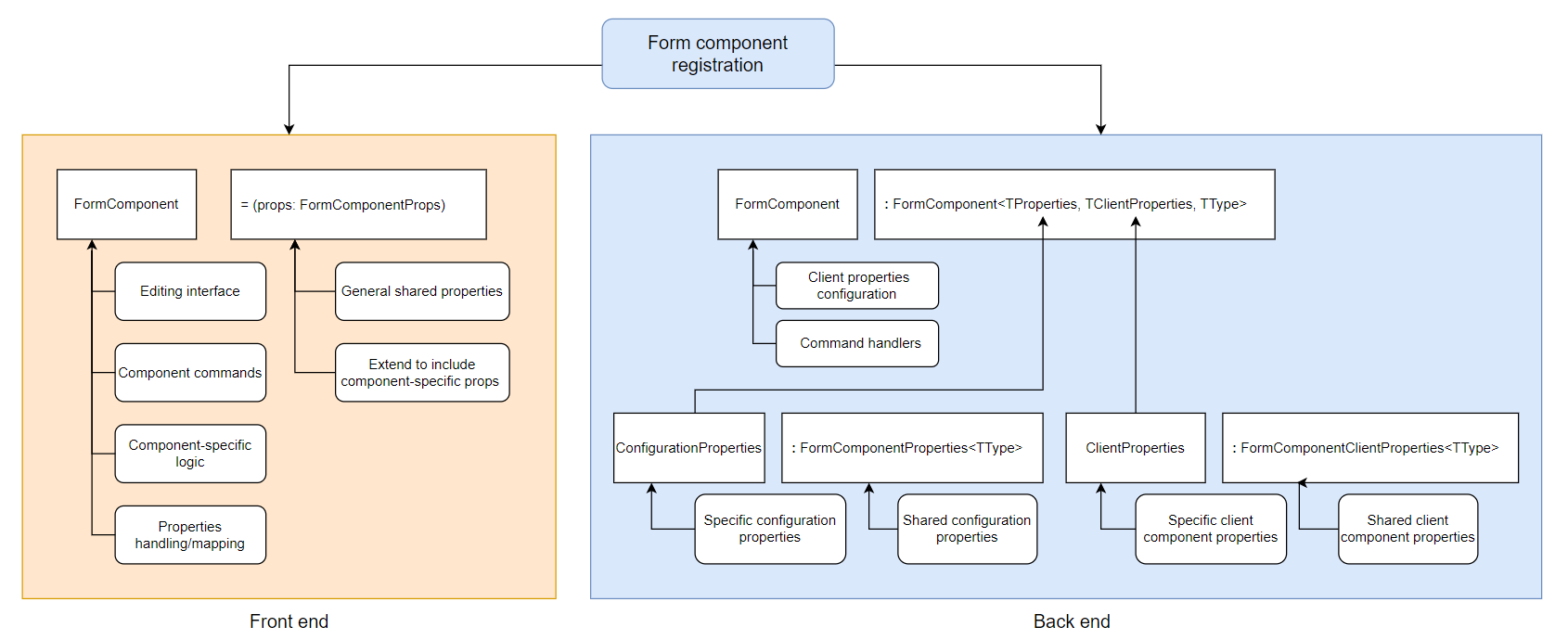
See Example - Color selector UI form component for a simple UI form component implementation.
Form component back end
Unless specified otherwise, all classes and members mentioned in this section can be found in the Kentico.Xperience.Admin.Base.Forms namespace.
Form component back end is formed around a class that inherits from the FormComponent<TProperties, TClientProperties, TType> base class.
For the purpose of this section, imagine you are implementing a form component with a single text input field and you want to allow users to configure the field’s placeholder text.
// Creates a new form component
public class InputFormComponent : FormComponent<TProperties, TClientProperties, TType>
{
    // Set to the name of the React component used to render the form component interface
    // The client application automatically suffixes the component name with 'FormComponent'
    public override string ClientComponentName => "@acme/web-admin-custom/Input";
}
When creating the class, you are forced to implement the ClientComponentName property. This property must be set to the name of the client React component used for the form component’s editing interface. You must provide a full name in the {orgName}/{projectName}/componentName format, as specified when you set up your custom admin JS module.
The client application automatically suffixes the component name with FormComponent. Make sure the component is exported (visible to other modules). For example:
- @acme/web-admin-custom/Input (the client suffixes ‘FormComponent’ automatically and attempts to load the InputFormComponent component exported from the @acme/web-admin-custom module)
This next section describes the generic parameters required by the FormComponent base class.
TType is the C# type (string, int, custom composite types) used by the back end when working with values returned by the component.
- To offer the component in the field editor, the type must be set to a data type registered in the system via
DataTypeManager– see Field data type management for more information and default field types. - To use the form component in various configuration dialogs (Page Builder, Form Builder, or model-based edit pages, for example), you can use any type suitable for their functionality (no need for additional registration).
TProperties must be a class that inherits from the FormComponentProperties base class. The class holds properties that are used to configure the component:
- when assigned to a field via the field editor (Form component configuration section). For these properties to be visible in the configuration interface, they need to have corresponding editing components assigned.
- when used as an editing component for other properties.
The FormComponentProperties base class contains the following properties:
Property | Type | Description |
Label | string | Label text rendered above the component’s input interface. |
ExplanationText | string | Text displayed directly below the field. Used to clarify the expected input. |
Tooltip | string | Tooltip which is displayed if a user hovers over the field. |
ReadOnly | bool | Indicates whether the component should be read-only (unable to be edited). |
Order | int | The order of the component in the form relative to other components. Higher values indicate lower priority - are positioned further down the form. |
Extend this class with properties required for the desired functionality of the form component. For example, in case of the single input component with a text placeholder:
public class InputComponentProperties : FormComponentProperties
{
    // Allows users to configure the placeholder text displayed within the input
    [TextInputComponent(Label = "Placeholder")]
    public string PlaceholderText { get; set; }
}
Form component attributes
Note that the PlaceholderText property is decorated with the TextInputComponent attribute. This indicates the property got assigned another form component to act as it’s value editor within admin UI dialogs. All editing component attributes are located in the Kentico.Xperience.Admin.Base.FormAnnotations namespace. See Editing components for more information.
TClientProperties must be a class that inherits from the FormComponentClientProperties<TType> base class, where TType must match the type specified in the main form component class.
This class holds properties required by the client React component. Typically, this equals the set of configuration properties from TProperties and any additional data required by the client component to render the editing interface (e.g., contextual information or some external data retrieved by custom logic). The class serves only as a data transfer object and should not contain any additional logic.
public class InputComponentClientProperties : FormComponentClientProperties<string>
{
    public string PlaceholderText { get; set; }
}
The client properties class needs to be manually populated with data that are to be sent to the client. For this purpose, the main form component class provides the ConfigureClientProperties method. The method is called by the system before component data is sent to the client and when processing component commands. A component’s current properties configuration can be accessed via the Properties member.
The method’s single parameter contains the component’s client properties class:
// Creates a new form component
// Component configuration is provided by the 'InputComponentProperties' class
// Client properties are provided by the 'InputComponentClientProperties' class
// The component works with 'string' values
public class InputFormComponent : FormComponent<InputComponentProperties, InputComponentClientProperties, string>
{
    // Set to the name of the React component used to render the form component interface
    public override string ClientComponentName => "@acme/web-admin-custom/InputFormComponent";

    // Fills the component's properties class with required data
    protected override Task ConfigureClientProperties(InputComponentClientProperties clientProperties)
    {
        // The system maps the properties from the 'FormComponentProperties' class
        // in the method's base implementation. They don't need to be mapped explicitly.

        // Sends the configured 'PlaceholderText' value to the client
        clientProperties.PlaceholderText = Properties.PlaceholderText;

        return base.ConfigureClientProperties(clientProperties);
    }
}
Dependency injection support
Form components support constructor dependency injection by default. You can use dependency injection to resolve instances of external services on which your component depends.
The main form component class together with the properties classes form the back end implementation of form component.
The following sections cover additional features that can be added depending your requirements. Or you can continue directly to the front end portion of the implementation:
- Components without configuration properties
- Modify form component value
- Add validation rules and visibility conditions programatically
- Define form component commands
Components without configuration properties
Not all form components may need to expose properties to configure their behavior. For components with fixed behavior that requires no additional configuration, you can inherit from the FormComponent<TClientProperties, TType> base class instead.
This type of component doesn’t require a dedicated TProperties class. Instead, it uses the FormComponentProperties base class directly.
Modify form component value
The FormComponent<TClientProperties, TType> base class provides methods to modify the form component value as it gets stored to or retrieved from the component.
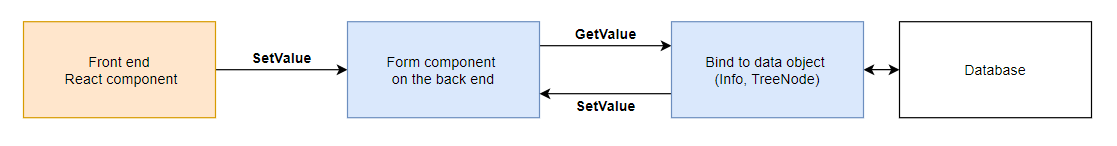
GetValue– gets the form component value. Called when binding values from the component to system objects (Info objects, pages). Can be overridden from the form component main class to modify the value before it’s retrieved by the system.SetValue– sets the value to the form component. Called when binding values from the database and from the client to the component. Can be overridden from the form component main class to modify the value before it’s set to the component.
public override void SetValue(string value)
{
    // Process the value before setting it to the component

    base.SetValue(value);
}

public override string GetValue()
{
    var value = base.GetValue();

    // Process the value before it gets retrieved by the system

    return value;
}
The following diagram below illustrates the data flow between the client and the database for form components on edit pages. The back end form component definition is used to evaluate field visibility conditions, perform validation, and define component commands.
Add validation rules and visibility conditions
UI form component validation rules and visibility conditions can be added directly to a component via AddValidationRule and AddVisibilityCondition.
Use this approach if you need certain rules and conditions to always apply, regardless of the specific form field configuration. You can also add validation that you do not wish to offer in the field editor (not registered via the RegisterValidationRule attribute).
For this purpose, form components provide a ConfigureComponent method, which is called during component instantiation. Within the method, you also have access to the component’s configuration properties (via the Properties member).
private readonly MaximumLengthValidationRule validationRule;

// Component configuration method
protected override Task ConfigureComponent()
{
    // Adds a validation on input length to the component.
    // This validation is always active for all instances of the component.
    validationRule = new MaximumLengthValidationRule(localizationService) { MaxLength = 50 };
    AddValidationRule(validationRule);

    return base.ConfigureComponent();
}
Form component front end
In the client-side application, the form component is represented by a conventional React component with properties.
import React from 'react';
// Imports the default form component properties class
import { FormComponentProps } from '@kentico/xperience-admin-base';

// Form component classes must be suffixed with 'FormComponent'
export const MyFormComponent = (props: FormComponentProps) => {

    // Describes the editing interface...
    return
        <></>;
};
Form component classes must be suffixed with FormComponent. The client application loads form components based on the name supplied to the ClientComponentName property from the back end and the FormComponent suffix.
The component’s properties class contains the same set of shared form component properties available on the back end. If the form component requires additional component-specific properties (as specified in the TClientProperties class on the back end), extend the FormComponentProps class and mirror the properties within.
Continuing with the input component example from the back end section:
import React from 'react';
// Imports the default form component properties class
import { FormComponentProps } from '@kentico/xperience-admin-base';

// You can extended the default set of properties by extending FormComponentProps.
export interface InputFormComponentProps extends FormComponentProps {
    // This property mirrors the 'PlaceholderText' property from the 'InputClientProperties' class on the back end
    placeholderText? : string;
}

export const InputFormComponent = (props: MyFormComponentProps) => {
    // Component-specific properties are accessible via 'props'
    props.placeholderText...

    // Describes the editing interface...
    return
        <></>;
};
The main purpose of the React component is to provide an editing interface for user input. The form component’s current value is stored in FormComponentProps.value.
// Use components from the Xperience components package to define the form component's
// editing interface while maintaining admin UI look and feel.
import { Input } from '@kentico/xperience-admin-components';

...

return(
    <Input
        type="text"
        label={props.label}
        name={props.name}
        // Sets the value of the input
        value={props.value ?? undefined}
        placeholder={props.placeholderText}
    />
);
When defining form component interfaces, use React components from the @kentico/xperience-admin-components package. The components come preconfigured for use in the admin UI and simplify maintaining overall look and feel. For an overview of all input components available in the package, see Reference - React input components.
The state of individual inputs contained within the form is managed by a stateful variable in a parent component. To maintain this state with up to date input values, FormComponentProps contains an onChange property with a callback function (provided by a parent component when the form component is loaded by the client application). The function expects the new component value as its argument – onChange(newComponentValue). The callback function ensures form field state can be uniformly updated across all fields comprising the form – instead of input state being stored by individual input elements, it’s maintained in one place by a stateful variable. In React, this pattern is known as controlled components.
Form components must call the onChange function with an updated value every time their input changes (e.g., by passing the function to an onChange handler of the child component used to obtain user input).
Declare a function with a single parameter of the type expected by the
onChangeproperty of the input component.- onChange property types of Xperience input components from the
@kentico/xperience-admin-componentspackage are listed under onChange Type in Reference - React input components.
- onChange property types of Xperience input components from the
Within this method, call
onChangewith the value received from the change event.- For components with whose editing interface consists of multiple inputs, the
onChangecallback must be handled for each input separately.
- For components with whose editing interface consists of multiple inputs, the
Pass the method as a parameter to the input component’s
onChangeproperty.For input components that don’t implement
onChangeevents (e.g., custom elements with unconventional ways of obtaining user input), you need to ensureFormComponentProps.onChangeis called appropriately after the input component’s state changes (e.g., after a user performs a selection).
Now, when the input component’s change event fires, it also calls FormComponentProps.onChange, which ensures the new value is reflected in the form data sent to the server on submit.
For example:
// Use components from the Xperience components package to define the form component's
// editing interface while maintaining admin UI look and feel.
import { Input } from '@kentico/xperience-admin-components';

export const InputFormComponent = (props: InputFormComponentProps) => {

    // Used to pass an onChange handler received from the parent to the actual input
    // The ChangeEvent generic parameter must correspond to the type of the underlying HTMLElement
    // used to edit the form component value
    const handleOnChange = (e: React.ChangeEvent<HTMLInputElement>) => {
        // If 'onChange' is undefined, do nothing
        if (props.onChange) {
            // Passes the new user input to a parent component where all field values are maintained.
            // e.target.value stores the most up to date input of the component.
            props.onChange(e.target.value);
        }
    };

    return(
        <Input
            type="text"
            label={props.label}
            name={props.name}
            // Sets the initial value of the input (obtained from the server)
            value={props.value ?? undefined}
            // Assigns the callback defined above
            onChange={handleOnChange}
            // Map other FormComponentProps as required...
        />
    );
};
Example - Form component front end
The following code snippet shows a full front end implementation of a simple form component that uses a single text input field to receive user input.
import React from 'react';

// Use components from the Xperience components package
// to define the form component's editing interface while
// maintaining admin UI look and feel.
import { Input } from '@kentico/xperience-admin-components';

// Imports the default form component properties class
import { FormComponentProps } from '@kentico/xperience-admin-base';

// You can extended the default set of properties by extending FormComponentProps
export interface InputFormComponentProps extends FormComponentProps {
    placeholderText? : string;
}

export const InputFormComponent = (props: InputFormComponentProps) => {

    // Used to pass an onChange handler received from the parent to the actual input
    const handleOnChange = (e: React.ChangeEvent<HTMLInputElement>) => {
        // If undefined, do nothing
        if (props.onChange) {
            // Passes the new value to a parent component where all field values are maintained
            props.onChange(e.target.value);
        }
    };

    // Describes the editing interface...
    return (
        // Maps form component properties to the Input component
        <Input
            type="text"
            label={props.label}
            name={props.name}
            // Sets the value of the input
            value={props.value ?? undefined}
            // Propagates an onChange handler that ensures input changes are
            onChange={handleOnChange}
            invalid={props.invalid}
            validationMessage={props.validationMessage}
            readOnly={props.readOnly}
            markAsRequired={props.required}
            labelDisabledTooltip={props.disabledMessage}
            labelIcon={props.tooltip ? 'xp-i-circle' : undefined}
            labelIconTooltip={props.tooltip}
            explanationText={props.explanationText}
            placeholder={props.placeholderText}
            dataTestId={props.name}
        />
    );
};
Define an editing interface consisting of multiple input elements
For form components whose editing interface consists of multiple inputs must propagate input changes via FormComponentProps.onChange every time one of the partial inputs changes (so the form state always contains the most up-to-date value).
For example, assuming you have the following component consisting of two text inputs with the two values separated by a dot:
import React from 'react';
import { Input } from '@kentico/xperience-admin-components';

export const MyFormComponent = (props: FormComponentProps) => {

    // Splits the current component value into two parts
    const [firstinput, secondinput] = props.value?.split('.') || ['', ''];

    // Update the first part of the input
    const onFirstInputChange = (e: ChangeEvent<HTMLInputElement>) => {
        props.onChange?.(`${e.target.value}.${secondinput}`);
    };

    // Update the second part of the input
    const onSecondInputChange = (e: ChangeEvent<HTMLInputElement>) => {
        props.onChange(`${firstinput}.${e.target.value}`);
    }

    return (
        <Input markAsRequired={props.required}
            label="First input"
            value={firstinput}
            onChange={onFirstInputChange}/>
        <Input markAsRequired={props.required}
            label="Second input"
            value={secondinput}
            onChange={onSecondInputChange} />
    );
};
Add support for form field metadata
Form field metadata comprises all the supporting information that can be configured via the field editor, such as:
- Required, Disabled, and Readonly status
- Field label and caption (tooltip text)
- Tooltip icon
- Field explanation text (shown below the input)
- Validation messages from assigned validation rules
This data gets passed to the client via the FormComponentProps object. Xperience input components from the @kentico/xperience-admin-components package already contain properties that allow you to map this information by default.
However, if you are developing an input composed of multiple elements, you might need to reposition how certain information gets displayed (e.g., validation messages). For this purpose, you can use the FormItemWrapper component.
import { FormItemWrapper } from '@kentico/xperience-admin-components';

...

return (
    // Wraps two input elements to better convey information relevant to the component as a whole rather than its individual inputs
    <FormItemWrapper label={props.label} invalid={props.invalid} validationMessage={props.validationMessage}>
        <div>
            <Input markAsRequired={props.required}
                validationMessage={''}
                label="Input 1"
                value={firstinput}
                onChange={onNamespaceChange} />
            <Input markAsRequired={props.required}
                validationMessage={''}
                label="Input 2"
                value={secondinput}
                onChange={onNameChange} />
        </div>
    </FormItemWrapper>
);
Register form components
Form component registration ties the back end definition and the client-side React component together.
The registration is done via the RegisterFormComponent assembly attribute, which takes:
- Identifier – a unique
stringidentifier of the form component. Consider specifying the identifier in a format that uniquely identifies your form component to avoid potential conflicts with identifier names. For example, use CompanyName.ModuleName.ComponentName. - ComponentType – the System.Type of the form component class.
- Name – the name of the form component when offered in the field editor.
[assembly: RegisterFormComponent("Acme.AdminComponents.MyFormComponent", typeof(MyFormComponent), "My form component")]
Component commands
Components commands allow UI form components to communicate with the back end after the initial render and before form submission. You can use commands to dynamically fetch data or alter component behavior (e.g., refresh data available for selection), based on user interaction, input, or other contextual events.
A component command consists of a:
- Command invoker – function defined in and called by the client React component (e.g., in response to a user action).
- Command handler – method defined in the form component class on the back end. Contains logic to execute in response to command invocation.
Command invokers
Within client components, invoke component commands via the executeCommand callback method obtained from the useFormComponentCommandProvider() hook.
import React from 'react';
// Hook used to obtain an instance of a command executor
import { useFormComponentCommandProvider } from '@kentico/xperience-admin-base';

export const MyComponent = ( props: FormComponentProperties ) => {

    // Callback method used to invoke commands from the component
    const { executeCommand } = useFormComponentCommandProvider();

    // Invokes the 'commandName' component command on the back end
    const result = await executeCommand<TResponseResult, TCommandParameters>
                            (props, 'commandName', commandHandlerArguments);
};
The executeCommand callback method takes the following parameters:
- (optional) TResponseResult – the type used to store command response received from the server.
- (optional) TCommandParameters – the type used to store parameters for the command handler method on the back end. For the system to correctly pass the arguments to the server-side handler, a matching type must be declared on the back end as well.
- props – the properties of the form component (
FormComponentPropsor derived type). - commandName – the name of the command handler method on back end.
- (optional) commandHandlerArguments – parameters that the back end handler gets invoked with, must be of the TCommandParameters type.
import React from 'react';
// Hook used to obtain an instance of a command executor
import { useFormComponentCommandProvider } from '@kentico/xperience-admin-base';

export const MyComponentCommands = {
    GetDataForSelector: 'GetDataForSelector',
};

export interface GetDataForSelectorParameters {
    stringarg: string;
    boolarg: boolean;
}

export interface GetDataForSelectorResponse {
    stringarg: string;
    boolarg: boolean;
}

export const MyComponent = ( props: FormComponentProperties ) => {

    // Callback method used to invoke commands from the component
    const {executeCommand} = useFormComponentCommandProvider();

    // Invokes the GetDataForSelector command on the back end
    const handleEvent = async (stringarg: string, boolarg: boolean) => {
        // The response is of the 'GetDataForSelectorResponse' type
        const response = await executeCommand<GetDataForSelectorResponse, GetDataForSelectorParameters>
                            (props, MyComponentCommands.GetDataForSelector, { stringarg, boolarg} );
        // Process the result
        doSomething(response);
    }

    return (
        // Assign handleEvent() where needed
    )
};
When a component command is invoked, the admin app sends a request to the back end, which invokes a corresponding handler method assigned to the command.
Command handlers
Command handlers are methods defined in the form component main class (derived from FormComponent<TClientProperties, TType>).
The purpose of handler methods is to respond to component commands on the back end and return a response (with data) back to the component.
Handler methods need to:
- be
publicand asynchronous - return an instance of
ICommandResponse<TResult>, whereTResultdescribes the response object sent back to the client component - be annotated with the
FormComponentCommandattribute
using Kentico.Xperience.Admin.Base;
using Kentico.Xperience.Admin.Base.Forms;

...

[FormComponentCommand]
public async Task<ICommandResponse<TResult>> GetDataForSelector(GetDataForSelectorCommandArguments args)
{
    return await assetsCommandManager.GetFolders(args);
}
Receive data from client commands
If you need to send data (command handler arguments) from the client as part of a command, the data needs to have a corresponding strongly-typed object representing them on the back end. This object then must be used as a parameter in the method handling the given page command.
The system automatically binds the received data to the object, allowing you to access it within the command handler:
public class MyCommandArguments
{
    public int ExtremelyImportantNumber { get; set; }

    public string DistressingMessage { get; set; }
}

public class MyComponent : FormComponent<MyComponentProperties, string>
{
    ...

    [FormComponentCommand]
    // Binds data received from the client to the MyCommandArguments object
    public ICommandResponse MyCommand(MyCommandArguments args)
    {
        // Use data received from the client
        args.DistressingMessage...
        args.ExtremelyImportantNumber...

        // Sends a response back to the client
        return ResponseFrom(new ResponseData(...)).AddSuccessMessage("Command data received and acted upon.");
    }
}
Formulate command response
The system provides an API that enables you to compose responses from command handlers.
[FormComponentCommand]
public ICommandResponse CommandHandler(ClientArguments args)
{
    // Instantiates a 'CommandResult' object that can be further modified by chaining provided extension methods
    return ResponseFrom();
}
A response may contain all of the following:
- status signalling command completion
- information message displayed on the client containing additional information for users
- data returned from the server that can be acted upon by the client
A command handler returns an instance of ICommandResponse<TResult> created by ResponseFrom<TResult> . TResult carries data from the server. To be acted upon by the component. Substitute the TResult generic with an object representing the command response data on the server.
// Data object class representing the command handler response to the client
public class MyCommandResult
{
    public string StringData { get; set; }

    public int IntData { get; set; }

    public MyCommandResult(string stringData, int intData)
    {
        StringData = stringData;
        IntData = intData;
    }
}

public class MyComponent : FormComponent<MyComponentProperties, string>
{
    ...

    [FormComponentCommand]
    public ICommandResponse<MyCommandResult> MyCommand()
    {
        // Obtain the data...

        // Sends a response object with the data back to the client
        return ResponseFrom(new MyCommandResult(stringData, intData));
    }
}
The method returns an instance of the CommandResult object that can be further modified by the following extensions (Kentico.Xperience.Admin.Base namespace):
Method | Description |
| Displays a general message on the client after a response has been received. |
| Displays a success message on the client after a response has been received. |
| Displays an info message on the client after a response has been received. |
| Displays an error message on the client after a response has been received. |
| Displays a warning message on the client after a response has been received. |
| Invokes a command with the provided name from the client template where the component is rendered. |
Designate command handlers
FormComponentCommand constructor takes the name of the command as invoked from the client template. If not specified, defaults to the name of the handling method.
// Designates the 'GetDataForSelector' method as the handler for the 'GetDataForSelector' command invoked from the client component
[FormComponentCommand]
public ICommandResponse GetDataForSelector()
{
    // Command logic...
}

// Designates the 'CommandHandler' method as the handler for the 'GetDataForSelector' command invoked from the client component
[FormComponentCommand("GetDataForSelector")]
public ICommandResponse CommandHandler()
{
    // Command logic...
}
Field data type management
All field data types assignable via the field editor must be explicitly registered. The system uses the metadata provided during registration to:
- generate the database columns storing the values of individual fields,
- configure code generator and field editor behavior,
- perform value conversions (and object mapping for complex types) when fetching data to and from the database.
When writing form components, this data type corresponds to the TType generic (specified in FormComponent and FormComponentProperties) provided when creating form component classes on the back end.
For information about data types registered in the system by default and the API used to registered custom data types, see Data type management.