
Designing forms using the Form builder
After you create a new form, you can design it either using the Form builder or the Field editor. The Form builder offers intuitive editor with only a limited set of options, intended for non-technically skilled users and marketers.
To display the Form builder interface:
- Open the Forms application.
- Edit a form.
- Switch to the Form builder tab.
Adding components to a form
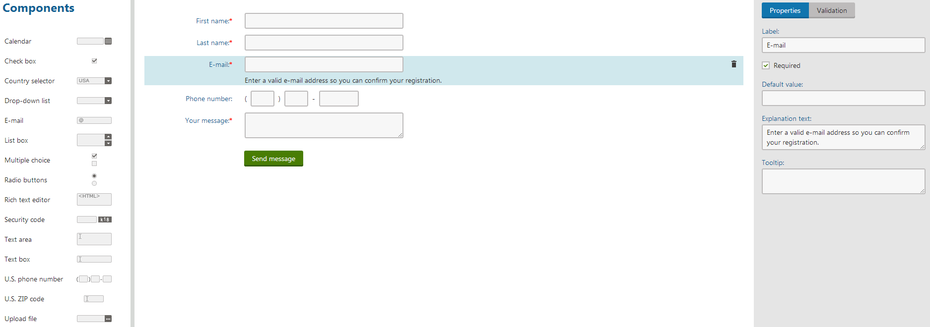
Choose a component in the toolbar on the left and drag it using the mouse into the form area.
- If you are adding the first component into the form, drop the component into the indicated area.
- If you are adding another component into the form, you can drop it at the beginning or at the end of the form or between any two components, which are already present in the form.
You can also double-click a component in the toolbar to add it to the end of the form.
The system automatically saves your form and displays the component’s properties in the right toolbar.
Changing the order of components in a form
- Choose a component among the existing components in the form and drag it using the mouse into a new position.
The system saves your form automatically.
Removing components from forms
- Select the component you want to remove from your form.
- Click the Remove component () icon.
- Confirm the removal by clicking OK.
The system removes the selected component from your form. However, the removed component will remain in the database and can be restored (made visible again) in the Field editor.
Changing component properties in forms
Select the component whose properties (label, default value, options, explanation text, etc.) you want to change.
- The system displays a toolbar with the component’s properties on the right.
Change the properties according to your needs. Depending on the type of the component, you can change some of the following properties:
Common properties
Label
The name of the field or element displayed next to it.
Default value
A preselected value or prefilled text.
Explanation text
Text displayed below the element.
Tooltip
Text displayed while hovering over the component label with the mouse pointer.
Variable properties
Required
Indicates, if the user is obliged to select or type some value in this element before submitting the form.
Options
Values listed in drop-down lists, list boxes, multiple choices or radio buttons.
The system automatically saves your changes and propagates them to the form.
Configuring validation rules for components in forms
- Select the component whose input you want to validate.
- In the right toolbar, switch to the Validation tab.
- Click Add validation rule.
- Choose the type of the rule using the first drop-down list.
- Configure the validation rule according to its specific settings.
- Click Apply.
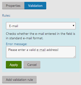
The system will now validate the chosen component according to the configured validation rule. You can add more validation rules for one component, but be careful not to create contradictory rules.
With all the fields defined, the form is ready to be published on the live site. You can do this in several different ways, which are described in the Displaying forms on the live site topic.